We have been inundated with GUSA information since Feb. 13, but the campaign has been most visible on our Facebook newsfeeds and the walls of nearly every public space on campus.
It’s easy to forget that the graphics and logos of these campaigns are, at the end of the day, what people will think of when they hear the name of a candidate. An eye-catching profile picture might even entice you to click on their website link and read their platform.
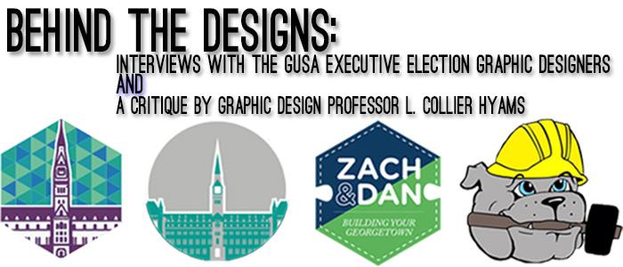
In recent years, the demand for high-quality graphics has risen, so we took the time to sit down with the designer of each campaign and talk to them about the process and the product. We then showed the various campaign images to graphic design professor L. Collier Hyams, who has never taught any of the candidates and has been entirely removed from the campaign, for an objective expert opinion.
The following interviews with the graphic designers have been condensed. The critiques by Professor Hyams are published in their entirety.
Lexi Dever (COL ’16) – Thomas and Jimmy
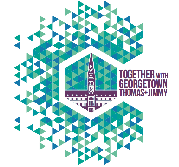
First, I had to kind of figure out what a solid campaign logo would be because I normally don’t work on campaign logos. I decided I wanted to go with, first and foremost, a unique color because I figured everyone would be doing blue and gray. In the end, no one did blue and gray but I chose shades of green, blue and purple because green represents a new beginning, blue represents the university and its history and purple represents equality.
The whole process took about a week. Once I kind of figured out what I wanted to do with my design, I spent more time working on it and spent a few hours a day if not more just working and cranking it out.
Once I finished the logo design I gave them some advice on how to use it and made them instructions in a branding packet. The whole campaign, from the beginning, was meant to be very versatile. I want it to be used in as many ways as possible.
All the custom typeface and color application of the 1968 Mexico Olympics was well thought out and is very trippy and very ’60s and it really inspired me.
Also, the success of the Obama campaign and how visually powered that was is still fresh in our minds. No campaign before Obama had a logo. It was always just text or a style, but not a logo. There has been a shift towards that element since the success of the Obama campaign. I obviously didn’t want to mimic it, but just the application of it and the ability to have a brand become influential in the campaign itself.
[dmalbum path=”/wp-content/uploads/dm-albums/t and j/”/]
LCH:
Well, this has a gothic feel to it, it’s got a little contemporary stuff going on but it’s gothic. I think that’s going to definitely bring in a certain sort of interest or personality. I see it as a C and I don’t know what the C is for. I also see it as sciences. As far as a campaign, so far, it’s the most developed but I don’t know if it’s saying what they’re trying to say. Color theory is fine, looks good that way. It’s done well.
JJ Jimenez (COL ’15) – Zach and Dan
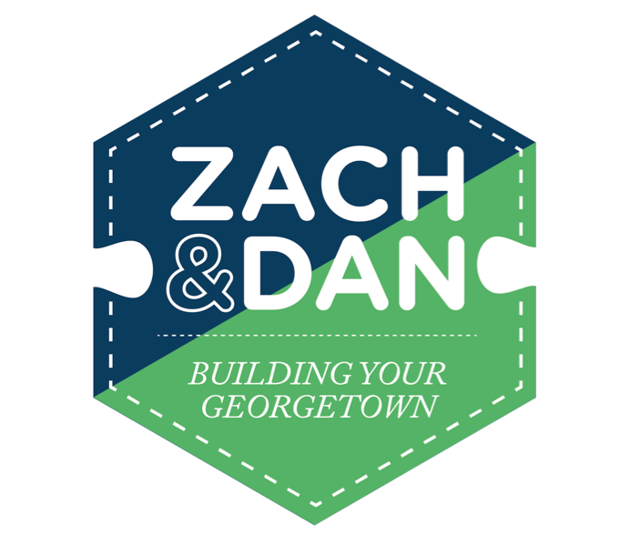
Going into the designs, we wanted to go with something kitsch and something very simple. Zach and Dan were very adamant about name recognition because at the end of the day, the logo or icon isn’t running for GUSA. They are.
The one thing that’s really important for me is to make sure the designs are replicable and consistent through everything. So you have the puzzle nubs, you have the dotted line, you have the text, you have all that. That’s the one piece that is so important to me when I’m designing things for whomever. Whenever we change the medium for anything it has to be recognizable.
This year, I’m actually on the team. (JJ has worked on two other campaigns in his time here at Georgetown). So when we’re on the team I’m like, “Hey, let’s do this, let’s push this, let’s do that,” so I’m a much more active part of this team.
What I’m making is by no means art. The stuff I make is, in my mind, far more utilitarian, in the sense that it’s trying to communicate something, it’s getting a message across.
[dmalbum path=”/wp-content/uploads/dm-albums/z and d/”/]
LCH:
It’s a pretty standard thing to have half navy blue, half green. But there’s some thought into this [cover photo], but do I think it looks like a campaign ad? No, I think it looks like gummy bears or clothing or something. (See third photo in above slideshow)
But it’s curious with the whole puzzle idea, so I think that would grab somebody’s attention. There are some weird things like things aren’t centered exactly right but that’s the only thing that would point to it being amateur as opposed to professional. This looks very slick.
So there’s not a single campaign design, there are a bunch of different designs. Well, the puzzle is the hook but the only thing that really holds it together is the names Zach and Dan. You’ve got the dotted line as sort of a theme but this could be a Gap commercial or a fraternity party, I’m not sure what it is. Out of all of these, I can’t actually tell what the people are supporting or doing so I don’t see any position. It’s fun, it’s trendy, but I don’t know what it is. It’s like a popularity contest. But it’s intelligent.
Innocent Ndubuisi-Obi (SFS ’16) & Martin De Leon (SFS ’16) – Trevor and Omika
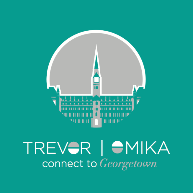
Innocent: I’m not really involved in GUSA. The design I did wasn’t like, “Oh, I’m so gung-ho for GUSA so let me design something for these guys to win.” Someone just approached me and they wanted a design done and I love doing designs so I was like, “Alright, I’ll help you guys out. I’ll make the base, hopefully you can stay within the same brand, but you have your creative liberty to do what they want.”
I really like helping people create their own brand. So when they approached me about doing it, the first thing I asked was, “What is the feel of your group? What do you guys want the feel to be? What is your approach going forward?” And they said they really liked the Jack and Maggie campaign from last year and so I sort of had the framework because I’m really good friends with JJ, so I knew his design process.
So, we just went with very plain, something nice for the eyes. The color scheme was their idea. They wanted teal and gray so I found the right mix of teal and gray.
The great thing about the design is that you can do a lot with it. It’s in an elementary phase where if another designer came on board and wanted to add something to it or change it a little bit, you can do a lot with it, it’s very flexible. So that was the whole goal.
Colors are an important thing too, you pick colors that are different, it can’t be blue and gray. They have to be warm colors and they have to make sense. Teal is a weird color, not a lot of people use teal, but the teal and gray works, it’s really nice and it’s really soft. I was thinking about profile pictures and about what you would want to see popping up.
Martin: They brought me on board for mostly communications and social media work. I serve also to help with their image in general. I did their photo shoot, I’ve been doing their variations of posters. I wasn’t in the platform-building process, I came a little bit later than that. As soon as I actually knew what they were doing, I became very impassioned about it and have become 24/7 about it. It’s been crazy but it’s been so much fun.
[dmalbum path=”/wp-content/uploads/dm-albums/t and o/”/]
LCH:
Similar take [as Thomas and Jimmy]. … It looks like the same designer. … Is it the same designer? Now, the color, what is the color about? What is teal related to? Here’s one thing that’s curious. If you look at the last presidential campaign, there are particular blues and particular reds that are used. And then, the Obama campaign is the wrong blue. So the original question was, “Why is that that color? That’s a mistake.” But then you realize, “Well, no, it’s a manipulation, it’s an advertising tool.” This is different for a reason, what is that reason. So maybe I’m just too interested in deconstructing it, but the teal means something and I’m not sure what it means. Is it just because it goes well with the gray? This one has a hardcore political current regime thing going on. They could have played with line weight, but it’s so Obama that it’s not even funny.
Brittany Berlin (COL ’16) & Scott Syroka (COL ’16) – Ben and Sam
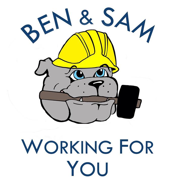
Brittany: I really don’t have much to say about it. One of my friends asked me to draw a bulldog and a sledge hammer, I didn’t really know what I was doing it for until after the fact. I really had little to no involvement; I’ve only met Sam once and it was after the campaign was up and running.
Scott: Ben and I knew each other through G.I.V.E.S. and I had designed Puppy Playtime posters for G.I.V.E.S. so that’s why they approached me to do theirs.
They gave me a lot of a freedom. They just emailed saying, “We need sixth sheets,” or “we need fliers for people’s doors,” so they would tell me what they wanted on it, like their Twitter or link on Facebook, and I had the leeway to draft something up.
They let me know whenever they need something or when they need something edited. I know the platform, I’m there for the meetings, but my focus is the design aspect. I’m not grinding out policy details by any means.
[dmalbum path=”/wp-content/uploads/dm-albums/b and s/”/]
LCH:
I walk through all the construction sites so to me this immediately has something to do with a campaign that is either for or against or somehow making construction work on campus better.
You can tell what these guys stand for, though. This one is relying on the cuteness factor of the bulldog. I’ve got some issues with the general design of the bulldog, it could be better. It’s not quite cutesy enough, it’s almost cutesy enough to be cutesy and it’s not quite detailed enough to be believable. It’s kind of in between. Like the hat’s in the wrong position and the handle of the hammer should extend out. If it’s going to be cartoony, it should really be cartoony.
General comments from Professor Hyams:
I think I’m out of touch with the generation and in terms of what is important. When I was in school I would be looking for something that affects my particular position or need as a student, but I’m not sure if that’s what’s necessary these days.
Well, the puzzle has a good strong feeling. The Trevor and Omika design is impressive but a weird color. The bulldog has the cuteness factor.
Well, from this year I thought the C stuff is the strongest (Thomas and Jimmy). All completely different approaches but the best design group is the triangle background one (Thomas and Jimmy).
One of these Zach and Dan ones is really smart (the cover photo), but they have too many different ideas. They’re not really focused.
The Ben and Sam stuff has the cute factor and you know what they’re doing. The one sheet and the door-knocking ones are interesting because they’re so different from the rest of the campaign; it looks like two different people did them.
In terms of if you just saw them, the one that would appear to be the most serious is Thomas and Jimmy. I think the Zach and Dan one is not bad too. The teal one could be really strong but it’s teal and we don’t know what that means. My initial reaction is that I wouldn’t go for that one. Even though it’s pretty strong and they’re probably a really good team, just the presentation is wrong.
[cardoza_wp_poll id=23]
Note: The graphic designers were interviewed in the order seen above and Professor Hyams was interviewed separately after of all the designers. He was not privy to any information given by the designers at the time of his interview.

Anonymous • Feb 24, 2014 at 11:24 pm
“No campaign before Obama had a logo.”
Are you kidding me?
Kim Jong Il • Feb 23, 2014 at 6:30 pm
IN NORTH KOREA WE HAVE MUCH OF CAMPAIGN LOGOS