Many different student groups on campus take it upon themselves to give each of the GUSA Executive Campaigns a grade leading up to Election Day. While The Hoya strives to remain impartial in its coverage, that hasn’t stopped us at 4E from ranking the campaign logos. If it isn’t aesthetically appealing, why bother in the first place?
1. Kamar Mack (COL ’19) and Jessica Andino (COL ’18)
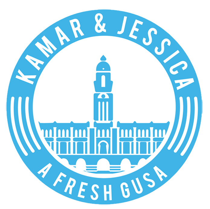
It’s light, I’ll give ya that. Lots of bright blue and white here, without any real contrast. Font is fun. Not quite Comic Sans fun, but friendly. I’m guessing that drawing in the middle is supposed to be Healy Hall, though I’ve never seen it look quite so phallic.
Wait a second. I’ve seen this logo before.
The slogan? “A Fresh GUSA?” Does that make you this year’s token “outsider” candidacy? Every year, candidates promote themselves as “the outsider ticket,” one that will breathe new life into our archaic student government. I could care less if you’re “fresh.” I want you to get the job done. I’m over it.
Grade: B
S(n)ide comment: “Just change it up a little bit before you hand it in so the teacher doesn’t notice. OK.”
2. Garet Williams (COL ’18) and Habon Ali (SFS ’18)
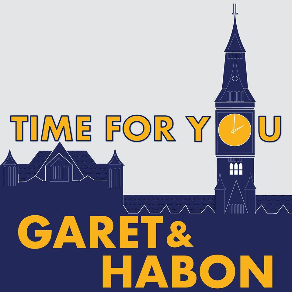
See, that’s a clever Healy! Using the clock on the tower as an “O”? Genius! I like the incorporation of yellow, as it pops against the grey background. It’s eye-catching.
Font could not be more boring. What’s with all the edges? I want round, inviting, smooth curves! Also, there is a lot of empty gray space up at the top. Don’t tell me you ran out of ideas before the campaign even began. That’s no way to win!
Grade: B+
S(n)ide comment: Way to play into the air of self-importance we Hoyas carry around. Why, yes, it is time for me.
3. John Matthews (COL ’18) and Nick Matz (COL ’18)
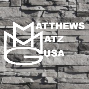
I see a crown. A crown. A crown atop a smug little “King G.” Well, that certainly won’t do. Boys, this is a democratic election! Don’t be crass!
Hold on. Now I’m reading in your platform that you two are the “GUSA outsider” ticket. I thought that was Kamar & Jessica? Ah, I see you’ve endorsed one another. Planning to divide the conquered land after the win, I presume? Sounds awfully oligarchic to me…
The gray stone is boring. And white font only? Honestly?
You could have at least had the font for the “Ms” and the “G” match the rest of the poster. It looks incongruent. Those are clearly not the same. And what, did you just Google “stone wall” the night before the tickets were due? I’m annoyed.
Grade: C-
S(n)ide comment: Hate is a strong word, but I really, really, really don’t like this.
4. Jenny Franke (COL ’18) and Jack McGuire (COL ’18)
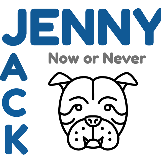
The “Y” in “Jenny” leaves the picture. Mediocre crop job, at best. Also, why is “Jenny” so much bigger than “Jack”? The spacing between the letters is all skewed, and the “n” in “Never” should not be capitalized. Why not just go CAPS lock and save yourself some humiliation?
I like the blue and gray motif, though pairing the slogan with a portrait of what I presume to be Jack the Bulldog is confusing. Is Jack saying “Now or never?” Or is “now” the time for Jack and “never again”?
This looks like a coloring book page someone gave up on.
Grade: C
S(n)ide comment: I’ve seen better editing on my Insta feed.
Images: www.kamarandjessica.com, www.garetandhabon.com, www.matthewsmatz.com, www.facebook.com/Jenny-Jack-for-GUSA-Now-or-Never-373676339680457, starbucks.com